Biocidin Botanicals
BRANDING
COLLATERAL
DIGITAL
PACKAGING
VISUAL IDENTITY
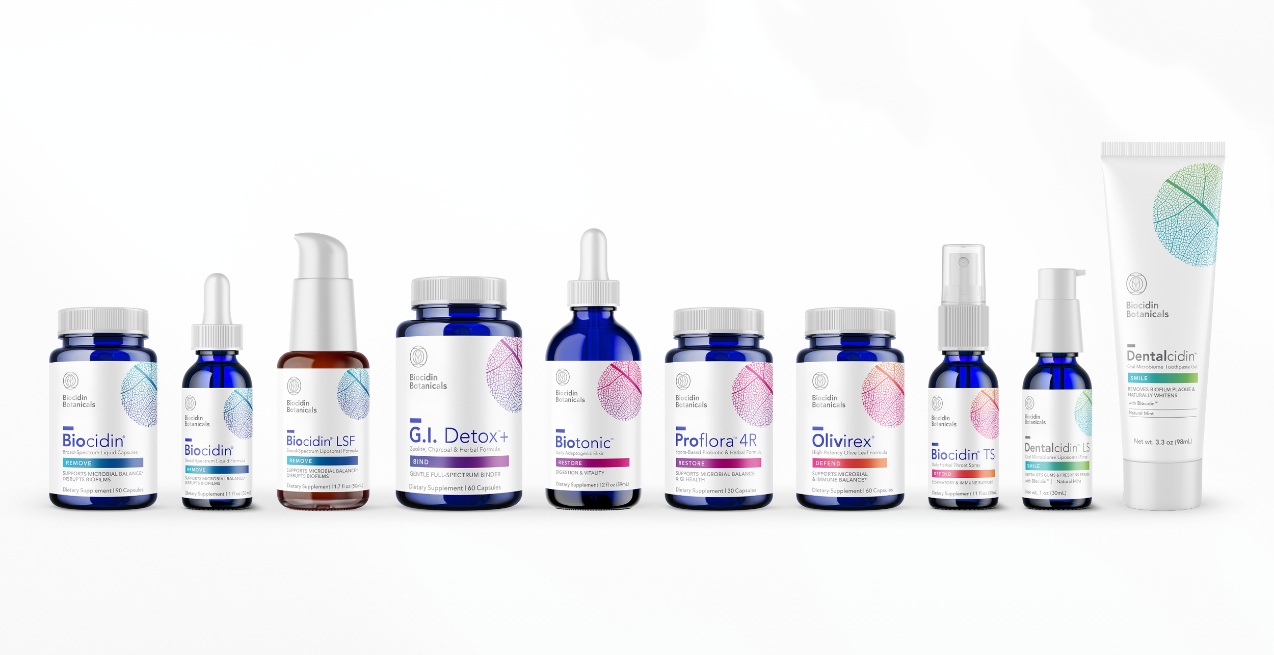
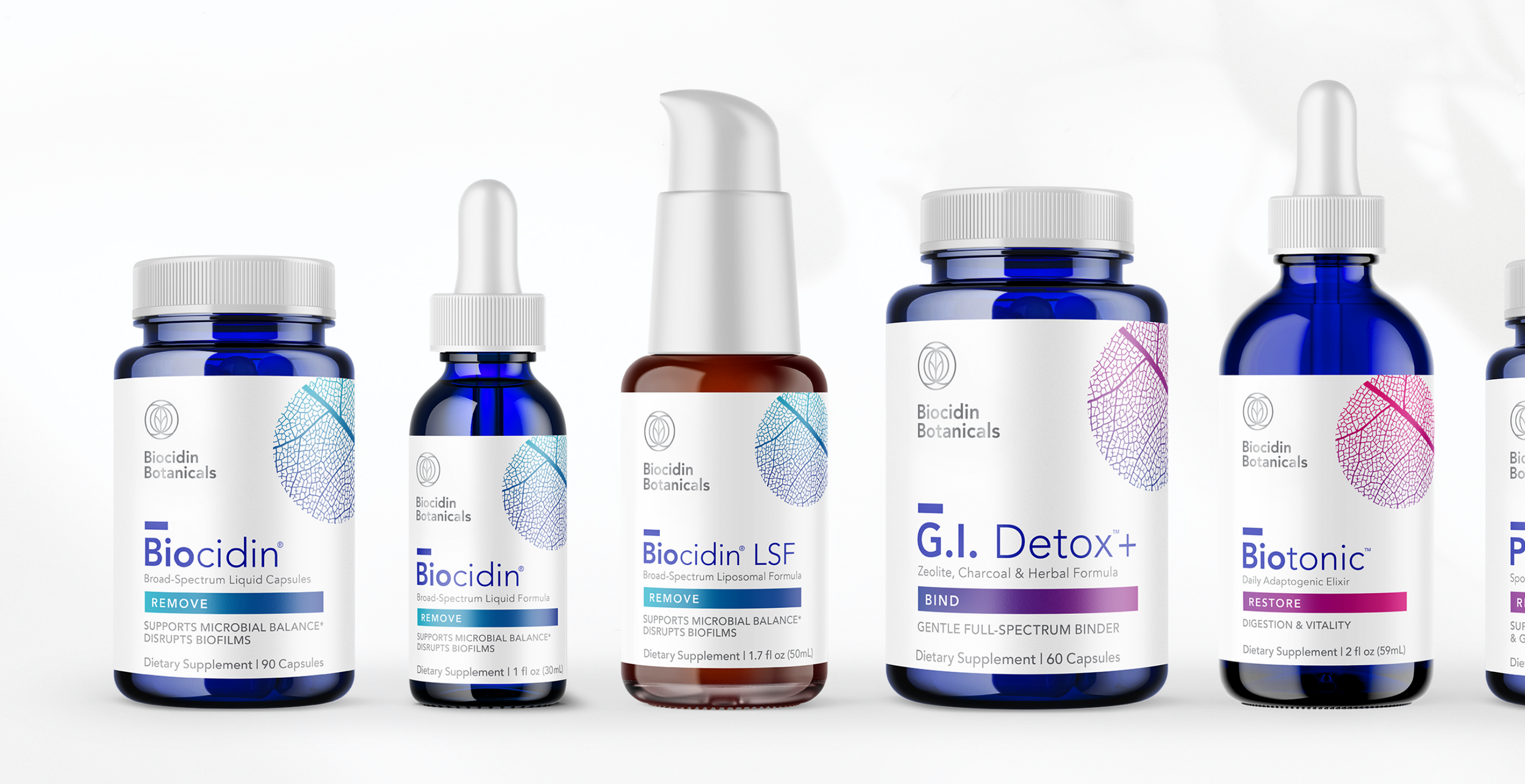
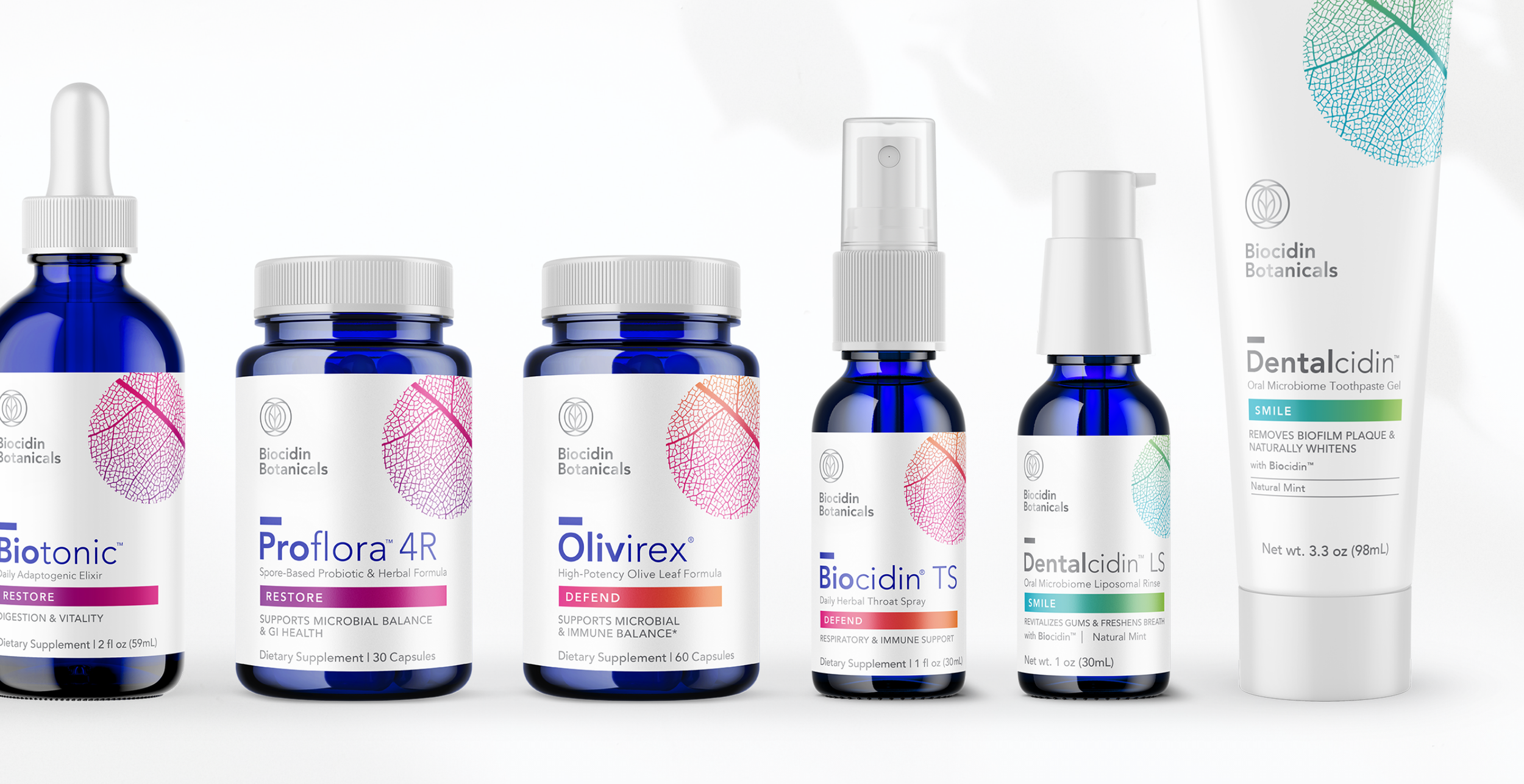
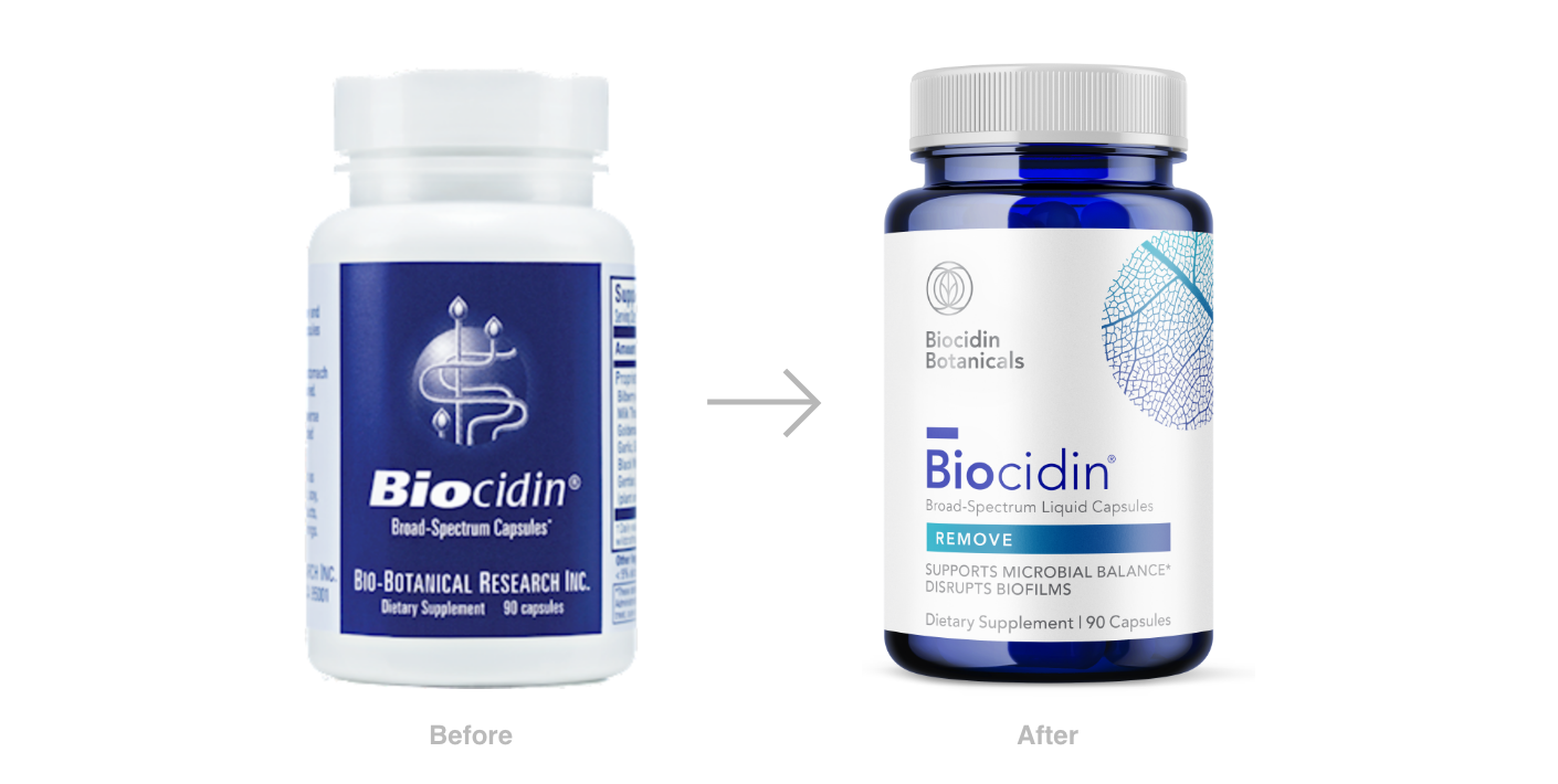
Founded in 1989 by Rachel Fresco, Biocidin was built on the healing power of botanicals, but as the company grew, so did the competition. Pure Branding led a strategic repositioning to highlight what set Biocidin apart, uncovering a simple yet powerful truth: it all comes down to the microbe. The creative challenge was to bring that strategy to life visually by portraying five key product categories and symbolizing their formulas in a clean, modern, and distinctive way.
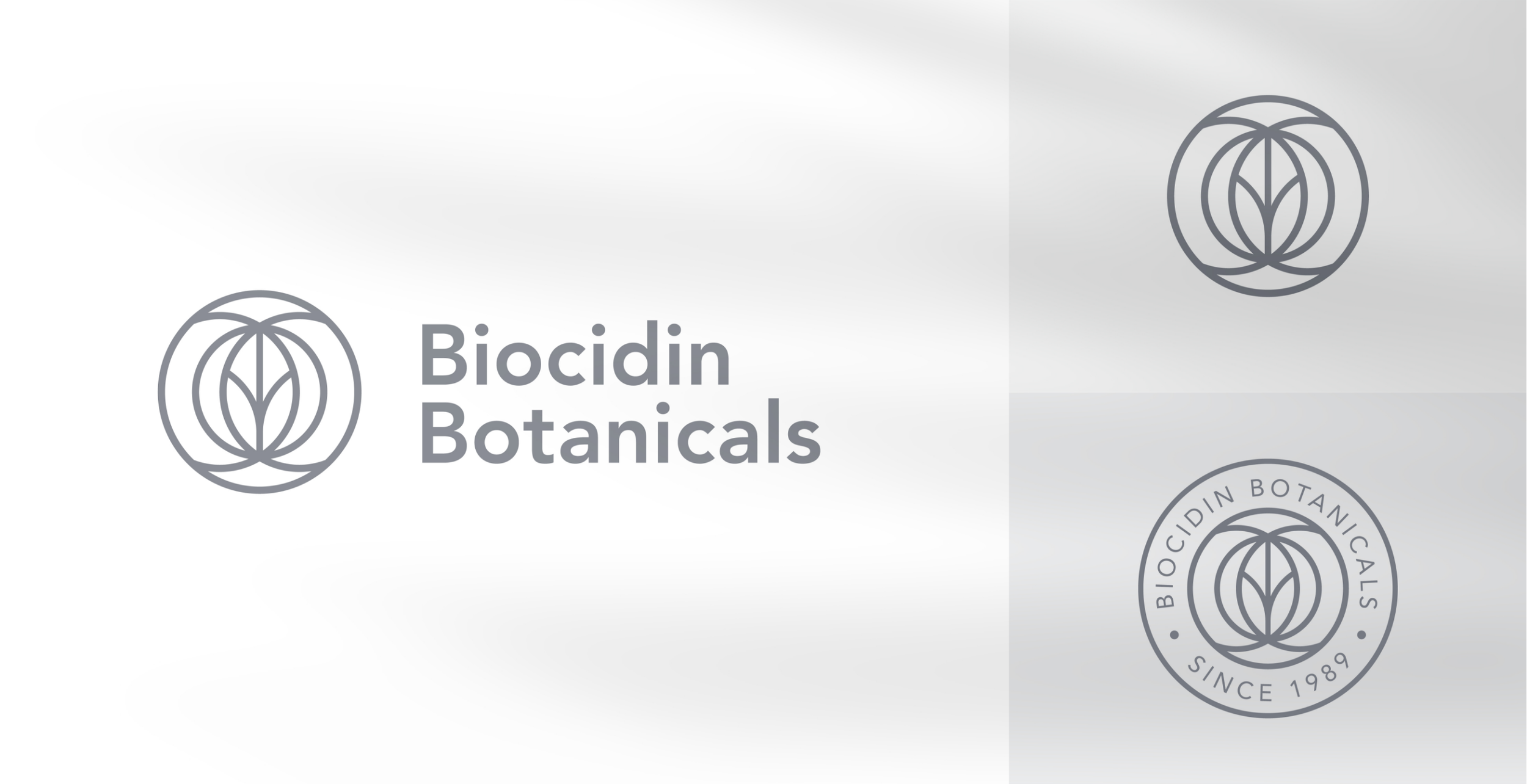
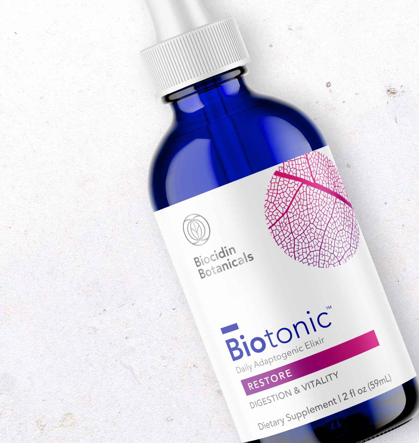
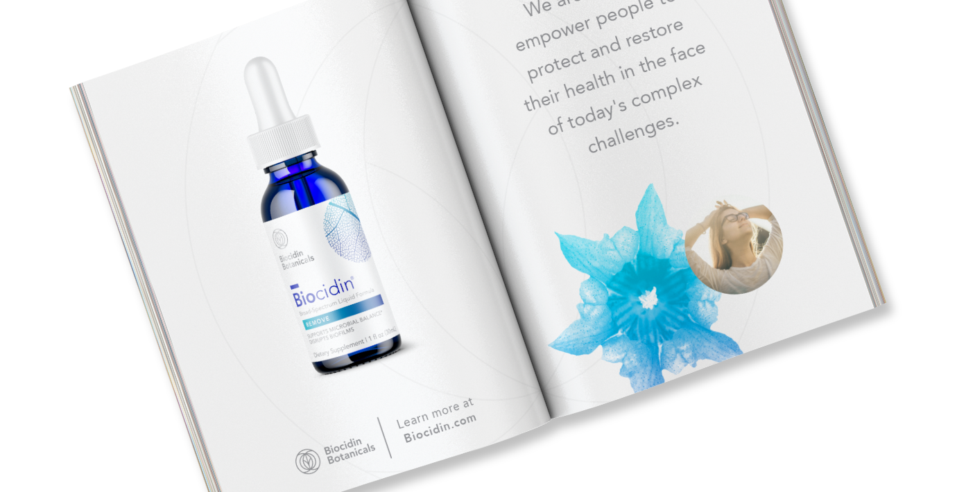
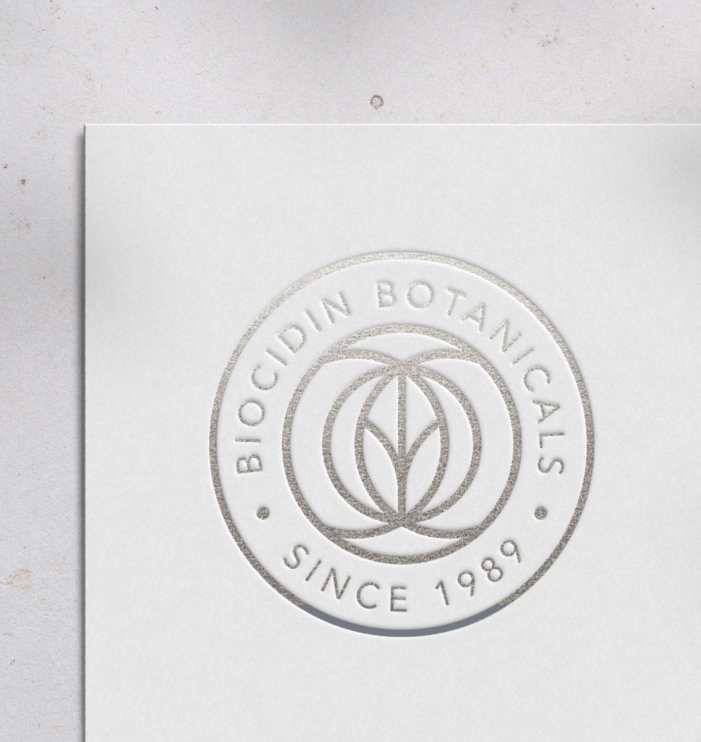
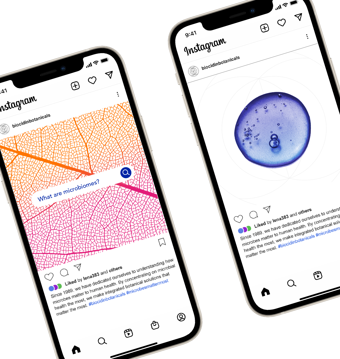
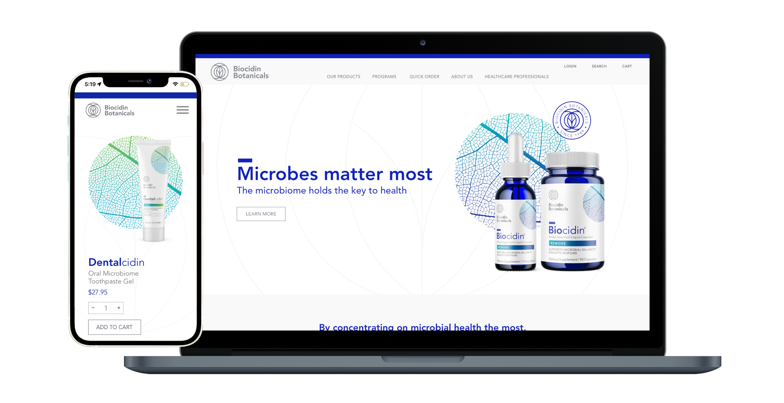
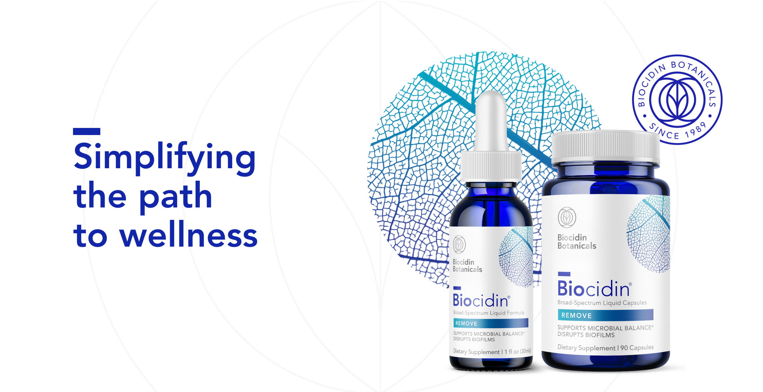
Grounded in the idea that “microbes matter most,” the new visual identity draws inspiration from both nature and science. The logo features a central plant radiating energy, while the core visual texture, a microscopic view of a leaf, captures the art and precision of Biocidin’s botanical formulas. This texture became uniquely Biocidin through five vibrant gradient colorways representing each product category. From packaging to website design, tradeshow displays, and brand collateral, every touchpoint balances clinical credibility with natural potency. The result is a cohesive, confident system that embodies Biocidin’s fierce yet approachable spirit and positions the brand for continued growth.
Following the successful rebrand and packaging update that reinvigorated the brand and sales, Biocidin Botanicals was successfully acquired by another industry leader.